Showing posts with label design context. Show all posts

Wednesday, 1 June 2011

Kick-ass


Kick-ass Movie.


This particular movie parodies the superhero conventions. It tackles the idea of a regular person becoming a superhero. It tackles how a real life superhero could exist in our universe. It uses popular culture throughout the film so the audience can immerse themselves and relate to that world. For example the main character in the film uses a popular social networking sites to talk to his fans. The writers have successfully established a main character which is relatable, early on in the film the narrator explains how he is different from the other superhero by not having any powers but just enough motivation to want to become a hero. He is sterotypically nerdy. One character points out that Batman and other heroes do not have any superhero powers like him but they were extordainry people in bizarre situations. The character sees himself as a average person until he plays the superhero and is forced into risky situations.

What I loved about the movie was the fact it made fun of its self. The central joke is how a average person becomes a pathetic but popular hero. The characters only real power is that he can be beat up for a vast amount of time without feeling any pain but is so weak in actually fighting villains. At the best of times the central character only just survives.

This idea of an 'everyman' (To quote the Simpsons) is what shaped my story for the comic.


Black and White

After deciding to make my comic in black and white only I had to decide more about the style of illustration. I have worked a lot in black and white before and love drawing detail and creating bold shapes and grey shadows which working in greyscale means you can achieve.

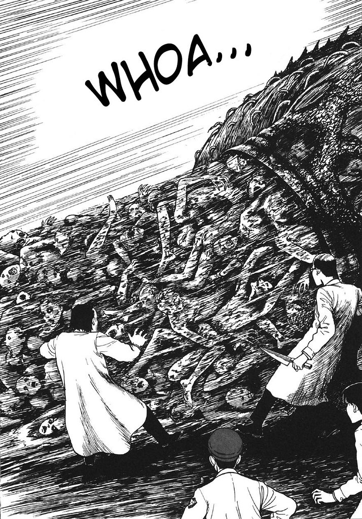
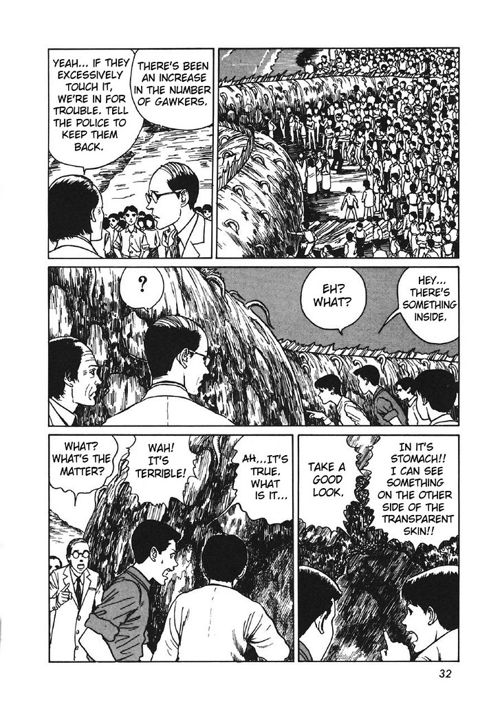
Junji Ito's work has so many brilliant elements to it, and I could see myself going down that route of comic book. Half of me wanted to carry on with comedy and satire, although the other half of me really wanted to something dark and a bit weird. Junji Ito's comics are fairly scary and horror/thriller orientated. I really admire the strong dialogue/story as well as the impressive visuals. There is something eerie and sinister which I love and wanted to try and emulate in my work.

DESIGN CONTEXT: My Influences


The Walking Dead.


A popular ongoing comic book series.
Set in post-apocalyptic world full of zombies a band of survivors join together. The comic is about the situations that the humans get themselves into. It is a riveting read as it tackles situations about how a world would restart. The comic has a strong fan base including many celebrities because of its style of writing. The drawings are mostly dynamic and in black and white. It is sold around the world and its success as a comic has led to it being a successful television series.


Popular Comic Books.

A quick search on Google for popular comics and you get what you would have expected. The superhero universe, the age old battle of the good vs the bad. It is the most popular structure for comics old and new. 
Each superhero has their own story but they are generally based about a outsider who has extraordinary powers. They are published by very successful companies. Marvel comics the largest of the companies is actually owned by the Disney corporation.  


The Superhero Genre. 


What I really like about these comics is the covers. The character poses are so dynamic. They tell the story of what the comic is like. The comics have high production values often having advertisements for other products inside.

I’ve had a interest in superheroes for a long time. It would be interesting to create a superhero style comic but with a modern twist.
These popular comics are a good starting point but its not the only way I could make this comic. The superhero genre is a popular area but its also a overcrowded area. Another superhero story could seem generic. Standout or different takes on the genre should be looked at.


Big Head - Jeffery Brown.
Published by Top Shelf Productions.


I wanted to look at other comics that were not necessarily the most popular but the ones that have a particularly interesting view on the superhero genre.

The big head comics created by Jeffery brown are clever super-hero parody collection of comics. Brown's comics are a good example of something similar to what I would like to achieve. Often drawing from real life situations, his comics are fun and light hearted. Brown also refrences the modern world
Although they may never be placed next to Spiderman in your local comic shop, they have been very sucessful in their own right.


Cowboy Henk.


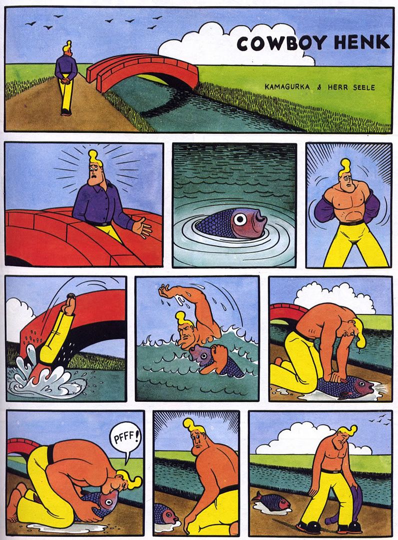
I am uncertain about the origins of this comic but it is popular on blog sites such as Tumblr and Blogger. The comics are single page sketches. They parody and mock certain parts of life. The colours and style are similar to that of the old beano and dandy comics. But the humour is very rude and risky. Adult comics.


Comic Diorama - Collected Comics - Grant Reynolds 2009. Top Shelf Productions.


Collections of short stories put together in an A5 format. Short stories based on journals recovered in a fire that took the life of the author. The journals are commonly known as ‘The Legends of Chance Oxblood'.

A very surreal collection of comics the stories are short and have limited text. A interesting view point exepcially as I have never considered basing a comic around real life events. The style of the comic flows nicely, it does change in drawing style from story to story but never does anything that doesn’t fit in with the rest of the comic. The minimal use of text in some stories is what Is fascinaticing as the illustrations can tell the story. Not a humorous comic in any sense as the tales can be slightly disturbing and the drawing style quite surreal.

The use of black pens to create texture and tone is what really stood out from the comic. Compared to larger scale production comics it is completely different. The characters are drawn in unconventional ways and is marketed to a adult audience as the stories are sometimes upsetting. Some stories are done with a single illustration on a single page.


Jack Teagle
Printed and distributed comics by 'NO GUTS NO GLORY'. 


Great sense of humour throughout his comics. The stories and illustrations are easy to follow, the sense of humour is light hearted but meant for a grown up audience. The drawing style is unlike other comics It is freely drawn and creative. The main emphasis is to create the characters and not the detailing on them. The characters are rarely put in life and death situations and even when they are they seem fun. 

Sherlock Holmes vs Skeletor 
Gareth J Brookes Self Published


The style of this particular comic is great. It does not rely on great image making to tell a good story. The story is fairly simple and set up as a sketch show. Each page being a different situation that the characters would get themselves into. The title of the comic and cover suggest that its going to be over the top big fight but actually the comic is very humane. there is no violence what so ever, It appeals to larger audience because of this.


DESIGN CONTEXT: B Movie Posters


B movie and old horror movie posters

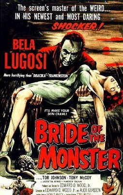
I also took interest of old horror movie posters. I loved the way people were used as props in the picture just to constantly look scared.the proportions of all the images as well where the monster and human would be the main subject. The text which would seem cheesy and over the top. The whole image is over the top horror it doesn't scare because it seems humorous to ever think these creatures existed. The women being used as props inspired the idea of a monster holding a girl in his arms. I used this idea in a drawing and put them in the background. The lighting and colour was heavy as want the images to seem more dramatic and over the top.

A large part of my desire to do this was my fascination with old horror themed B- Movie posters. I found out that many B Movies only went into production after the film poster had been designed, and would often base the entire film from what was on the front of the poster. I thought it was fascinating that you could tell a story on just one image and then to make a movie of it. Also they had an element of humour, wether it was intentional or not. 
 

Parody

Using popular culture

In my work I tend to use cultural references as an initial idea for a single or set of illustrations. I don’t mean this in the sense I copy a photograph or a still from a film and turn it into a illustration. I try to parody situations, mainly those of film and the media. The drawings and illustrations are still based to suit a younger audience so I tend to mock or comment on things that appeal to that age range more often.

Parody
There re many popular television programs that work in a similar fashion. Sketch based shows such as 'Family Guy', and South Park' take references from the media and comment or mock it. Most of the time it used for a humorous effect. I often use my own interest in film and television to shape what I do. Most of the time my interests reflect the interests of my audience demographic for example my illustrations based on Star Wars parodies have gained a lot of attention on the micro blogging website Tumblr.com.

Here are some examples of popular film and television which use satire and parody in their work...

1) Insheeption (2010)- South Park, Comedy Central, USA. 


The title of the episode is derived from and also satirizes the 2010 film Inception. The episode's title and plot parody and make many references to the film Inception, with the main characters from the film playing a major part on the episode. The movie's supposed complexity and subsequent critical acclaim are also satirized with Sharon claiming "Just because an idea is overly convoluted and complex, doesn't make it cool."

South Park verges on the offensive to many although it's fan base and creators stick by it's dark comedy and razor sharp cynicism. Of course for a parody to work it doesn’t have to mock the situation to the same degree that shows like South Park do, there can be many subtle and less controversial ways to reflect on popular culture.


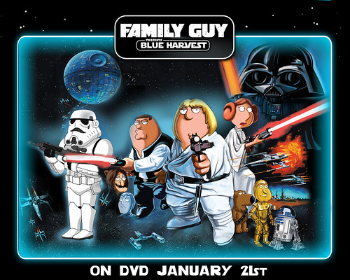
2) Blue Harvest, 2007, Family Guy, Fox Network, USA.


The episode is a retelling and parody of the blockbuster film, Star Wars Episode IV: A New Hope, recasting the show's characters into Star Wars roles. The show also parodies various manner of media. Near the end of the show one of the characters references that Robot Chicken (a similar animated show shown on the same network) already did the same thing three months earlier. A discussion follows in which Peter (the protagonist of family guy) denigrates Robot Chicken as another character, Chris (whom appears in both shows) defends it.


What I love about these shows is the way they can parody and mock situations that are instantly recognisable and fun to view. The humour sometimes can be a little distasteful but it works with the shows format. I plan to start drawing using references from popular culture. I will take a more light hearted approach at first however. As I don’t want the work to seem grotesque or use any dark humour where it is not needed. I will reference what I already have an interest in as this seems to strike a chord with my audience.