Wednesday, 1 June 2011

The finished comic


The comic in the end was printed using the college resources. The comic cost under a pound to develop, which is good as it will be cheap to mass produce. I will produce as many as I can and put them in the right places.

The right places?

First I will make them available to buy online. people visiting my website could buy one and one will be sent over to them.

Secondly I will ask to have them put up in comic book shops around the UK. I will go around the city centre first, going into popular comic book shops such as OK COMICS and TRAVELLERS MAN both allow self publishers to display work.

Pricing?
I will price the comic at 3 pounds as this is the standard in self published comics in this size

Printing the comic

The comic is roughly 20 pages long which is a lot more then I previously planned. The production costs need to be cheap so I can mass produce the comic and send out to publications and sell in store and off my own shop online.

The inside pages will be printed at low cost. Probably from a printer that has easy access. The cover will be printed independently at a higher cost and added on later. The cover will be printed from using the college resources. The cover is printed on matt paper as it is the thickest available in the print shop.

Printing from third party

some other students creating books or magazines are sending work to be printed by a separate company. I thought a lot about this as I could send off the finished files and have them printed professionally. The comic could look better because of this and less time consuming to make It could also have a hardback cover. The problems with this though is that its will cost a lot. A fellow student had a book he made printed, the total cost of one book printed came up to 90 pounds. Even if one my comics only cost 5 pounds to print each I would have to sell them over that price. Many comics that are self published have a price range from a pound to a few. The comics should be cheap to obtain not a lot of people will spend vast amounts of money on a character that have never heard of.

The Final Comic

The finished comic can be viewed using the issuu tool below.

i added small little details to make the comic more presentable.

Added contact details to the start of the comic.
Pre made boxes that the illustrations can sit in. The originals being too scruffy.
The pattern used on the cover is being used as the back print as well
Added drawing about how the heros storys could continue (attack of the 12 year old chavs)

Final Comic!

Final Cover


This time I wanted to connect with the story of the comic. Still similar to that of a B movie with the villain being shown just as much as the hero, I wanted to create a cover with colour as well. The whole comic itself is in greyscale. So it would be nice to have a cover that stood out in full colour. I spent more time in the editing of the piece then predicted because I had changed what I had previously planned. The villain was made to look scary but also amusing to view. The protagonist is put in the image but is not the main figure. It also the first time in a while I have drawn the character using colour. I also added a title with this one.

The title seems silly but I couldn't think of what to actually call the comic. The main character never really reveals his name. Following the b movie fashion I wanted the title to be about the villian and not the hero.

Cover?


This is the part I am probably the most excited about. Superhero comics allays have great over the top covers. They should be able to tell the story of the comic on a quick glance. I wanted to pay homage to this by creating a over the top fun cover.


first rough draft of cover
Created using similar methods to the inside of the comic
this was done so i can understand what scale i want the comic to be in. i want a large part of it to be the villian and how scary he is.


cover idea 1
In this I tried to put the main character in some sense of peril. Similar to b movie posters for old horror films. It was drawn up using heavy mark making techniques. The problem with it is that doesn't stand out. The cover is a great way to be colourful and draw in the audience. The image may look nice and explain the perils of the character in a over dramatised fashion but it wouldn't stand out on a shelf with other comics looking better in full colour.


Putting the final comic all together


I am in the stages now of putting the final pages together. Text is slowly being added to the panels that are missing it so the audience can understand the story of the hero.
The dream like sequence i drew up before is finally going to be used in the comic. This time i will use it as a bridge and turning point before the final fight of the two main characters

Adding more to the story


When drawing up the new panels I started to put in text. I was going to plan to put this all in at the last minute but I wanted to see how they could fit on the page. The dialogue in most the panels is short and this is generally how I want it to be. I think too much time explaining the obvious could ruin the comic. The text itself is handrawn as putting in text digitally could ruin the homemade style of the comic. The text for the other images is added on via photoshop.


The new pages including these should add a lighter tone to the comic. it is also a way to pace it out so it isnt too easy to read. 

After this assessment I went back to the drawing board. I still plan to use a lot of images and I had created before but add in new ones to help with the pacing of the comic. These need to be areas that fill out the comic and add pacing and some sense of reality.

I wanted to add a little humour to the comic. The basic structure of the comic explained what the story is about but I also want panels to describe what kind of character the main person is. These panels don't have to follow the main story but can create a wider knowledge of the character.

For example the main character taking time off to explain to the audience why he looks this certain way. I could develop his everyday habits and incorporate it into the story, it could parody itself by breaking the 4th wall and talking to the audience about his problems.

presenting the mock up


I presented a mock up of the comic in one my crits, It was just the drawings I had shown before but presented in the format that I wanted to sell it. Their were many elements missing such as the text and cover so I had to explain them to people for now.

Feedback on mock up

Positive
The main story is quite easy to follow( even without text)
style flows throughout


Negative
too much action
the ending is still disjointed could be fixed together with the use of text
the comic needs to have more pessimistic reality.
The pacing and timing of panels needs to be reassembled

Drawing up the comic


I wanted to spend time creating the actual comic I am happy with the style of the comic and its setting and tone. I just need to spend a vast amount of time creating it.

I will develop the main story first and put together a mock up of the comic, it will be shown to people and I will hopefully get useful feedback with what I should do before developing it further.

As you can see I have chosen this style in the end. As It allows to be versatile and creative with the ink and pen. I will putting in text later as I am mainly concentrating on drawing the comic.

using inks


This is a different style to what I initially had planned . This time I have used water colour and pens to create a sequential piece. Instead of creating the whole comic by just using black pens I could introduce texture with inks. They are a lot less time consuming to create then using just pens. The brush strokes create textures and tone, it is also a little bit different from the rest of the styles on offer from other comic books.

The style works well as it lets be more playful with image. The pens felt too constrictive and filling out areas seemed like a time consuming choir.
 

Creating more stories


I want to spend time creating story's with the superhero character. I wanted to imagine a comic book hero that already had established his story and could be mocked around with. I wanted to see if put him in normal day situations. I could put these sub storys into the main as a kind of filler to the main story. This way I could put more into the comic.

I am happy with the main story of the comic but I am having trouble with various parts of it.Particularly


the ending

it just seems to end at the moment. There is no closing comments or what could be done next

the villains

what will the villains look like? Will they be larger then life or more realistic thugs.they could be made to suit our world more then comic world. They could be chavs,neds,pikeys or rather unpleasant people. This way the audience could relate to being bullied by someone bigger and wanting to have sort of revenge.
 

First draft of a comic page


drawn on a bigger scale and then scaled down to to be printed on a smaller format like A5. This draft let me see how a typical comic page could look.

The idea behind these panels is that the main character wants to be a superhero.each superhero is unique in some way but share the same traits such as muscular abnormal strength or very intelligent. I wanted this character to have none of theses and slowly learns that his dream of becoming a superhero is just a dream and not a reality. The problem with having a whole comic like this though is that it could be too depressing. I want to have fun with the superhero world not just mellow it out.
 

Draft Panel Ideas


These are the first attempts at layout I did (very rough obviously) to fit in with the story I had so far. I liked the idea of a very ordinary but a bit of a loser man who gets beaten up (refrences to Kick-Ass) and then tries to get his revenge by creating his alter ego and going after his tormentors

Initial Owlman Illustrations


first time the costume is seen on paper. The idea behind the costume is to make it seem generic, to parody the over top nature of comic book heros.Both drawings are put together to make the hero seem dynamic. the second illustration, I used tones similar to those i found previously in b movie posters. this was done because i had an idea to make the comic seem retro

How Owlman sees himself

I had an idea that although Owlman himself is a bit of a loser, secretly he also thinks he could be something great. Almost like a dream sequence he sees himself as what he believes he could be.

Owlman comes to life


Rough drawing of the main character reflecting on himself. I like this idea of the character being a loner and him being a bit self depricating. It would mean I could explain the character then just putting him a action packed scenario all the time.


Idea of using smaller pens to create more detail in the frames. This was just drawn to see roughly how long it took to create a panel for the comic with more detail. As predicted though it was time consuming and only really made the backgrounds stand out. I will not be developing this style any further.

Ideas for comic strips.


Short stories to flow into one big story.
Must have start and a end

How the characters seems himself, and then is shocked by the realitly of his situations
relating himself to other more successful superheroes
making a costume
the origin of the superhero
putting him in realistic situations
ie tell the story of how the hero is going to give up smoking to change his lifestyle.
Put him in awkward situations

ideas and drafts for the panels

It is good to come up with a story for this creation but he must drawn in a sequential format which flows throughout a full comic.

Kick-ass


Kick-ass Movie.


This particular movie parodies the superhero conventions. It tackles the idea of a regular person becoming a superhero. It tackles how a real life superhero could exist in our universe. It uses popular culture throughout the film so the audience can immerse themselves and relate to that world. For example the main character in the film uses a popular social networking sites to talk to his fans. The writers have successfully established a main character which is relatable, early on in the film the narrator explains how he is different from the other superhero by not having any powers but just enough motivation to want to become a hero. He is sterotypically nerdy. One character points out that Batman and other heroes do not have any superhero powers like him but they were extordainry people in bizarre situations. The character sees himself as a average person until he plays the superhero and is forced into risky situations.

What I loved about the movie was the fact it made fun of its self. The central joke is how a average person becomes a pathetic but popular hero. The characters only real power is that he can be beat up for a vast amount of time without feeling any pain but is so weak in actually fighting villains. At the best of times the central character only just survives.

This idea of an 'everyman' (To quote the Simpsons) is what shaped my story for the comic.


Story and Character formation


Brainstorming story and character ideas...
-The story of a failed superhero
-Dark humour with surreal like moments with a certain grip to realitly
-Small stories that link up all following the central protagonist characters
-main character to be useless and bigheaded, arrogant
-Narrated by main characters

-The character must be average. 
-Too much of the superhero universe is based on men having a unnatural musicalar physique.
-To have problems shared by the general population.
-Balding
-chubby
-sweaty
-short

The character has to appear useless. He is trying hard to be a character that he is not and failing at every turn

He has to appear as a generic superhero and doesn't really stand out in any way. The reasoning behind this is that I want to play on the overcrowded superhero genre.
 

Owlman is go

After sitting down and writing my brief I decided it was time to come up with a rough idea for my comic. I have said before I like the idea of my main character being an anti hero. The comic will be bleak but funny and will document an average man's desire to be super human. Often failing more than succeeding.

I don't really want him to have a superhero name or a regular person name (a bit like Edward Norton in Fight Club) but for the purposes of my own refrencing he will be Owlman. Mainly because one of my initial ideas was to have a gang of half men who were half woodland creatures.

Anyway...some initial sketches for you


Final Brief

Horror or no Horror?

As I have said before I was still in two minds about what direction the story should go. I love what you can do with horror, the illustration side of it in particular, however I decided to scrap that idea for now.

My reasons for this are...

1) May not appeal to as many people
2) Writing a story is not my strong point and I don't feel confident writing for that genre
3) I want to make use of my parody ideas
4) I want the comic to be fun to read


I have decided that I will base my comic around the idea of a modern super hero. I want the comic to be funny but also a little dark in places. I don't want the main character to resemble any other existing super heroes.

Black and White Pt II.

When I set out to draw in black and white I noticed I had two styles to work with - one is not dissimilar to Junji Ito's detailed and surreal work. I have worked in this style many times before and feel comfortble with it although I have never tried to apply this style to real life scenes as you would with a comic. I use it more to draw demons, monsters and strange shapes and patterns. (see below)

I was worried that drawing is this style may limit what I could do with the small format of my comic. I feel this style of detailed illustration is suited best to large format.

So instead I went back and looked at a few illustrations I did several months ago, these are black and white illustrations based on photographs of real life events in 1950's America. (see below)


I think something based on this style would work best for my comic.

Black and White

After deciding to make my comic in black and white only I had to decide more about the style of illustration. I have worked a lot in black and white before and love drawing detail and creating bold shapes and grey shadows which working in greyscale means you can achieve.

Junji Ito's work has so many brilliant elements to it, and I could see myself going down that route of comic book. Half of me wanted to carry on with comedy and satire, although the other half of me really wanted to something dark and a bit weird. Junji Ito's comics are fairly scary and horror/thriller orientated. I really admire the strong dialogue/story as well as the impressive visuals. There is something eerie and sinister which I love and wanted to try and emulate in my work.

COMIC DEVELOPMENT - Monsters or no monsters?

As I started to experiment more with monster style characters - making them colourful, funny and putting them in strange situations I started to think about the storyline of my comic more.


Although I enjoyed doing these illustrations I couldn't really get the flow of a story or see how I could fit a story line together out of what I was doing. I then looked through some of my newly purchased mini-comics made by independent comic artists and noticed how simplistic they were and more importantly ....black and white. Printing and colour wern't things I had taken into consideration before. I know I want to re-produce the comic at least 20 times, and I want it to be something which is relatively cheap to re produce. I then made the decision to produce my comic in black and white only.

DESIGN CONTEXT: My Influences


The Walking Dead.


A popular ongoing comic book series.
Set in post-apocalyptic world full of zombies a band of survivors join together. The comic is about the situations that the humans get themselves into. It is a riveting read as it tackles situations about how a world would restart. The comic has a strong fan base including many celebrities because of its style of writing. The drawings are mostly dynamic and in black and white. It is sold around the world and its success as a comic has led to it being a successful television series.


Popular Comic Books.

A quick search on Google for popular comics and you get what you would have expected. The superhero universe, the age old battle of the good vs the bad. It is the most popular structure for comics old and new. 
Each superhero has their own story but they are generally based about a outsider who has extraordinary powers. They are published by very successful companies. Marvel comics the largest of the companies is actually owned by the Disney corporation.  


The Superhero Genre. 


What I really like about these comics is the covers. The character poses are so dynamic. They tell the story of what the comic is like. The comics have high production values often having advertisements for other products inside.

I’ve had a interest in superheroes for a long time. It would be interesting to create a superhero style comic but with a modern twist.
These popular comics are a good starting point but its not the only way I could make this comic. The superhero genre is a popular area but its also a overcrowded area. Another superhero story could seem generic. Standout or different takes on the genre should be looked at.


Big Head - Jeffery Brown.
Published by Top Shelf Productions.


I wanted to look at other comics that were not necessarily the most popular but the ones that have a particularly interesting view on the superhero genre.

The big head comics created by Jeffery brown are clever super-hero parody collection of comics. Brown's comics are a good example of something similar to what I would like to achieve. Often drawing from real life situations, his comics are fun and light hearted. Brown also refrences the modern world
Although they may never be placed next to Spiderman in your local comic shop, they have been very sucessful in their own right.
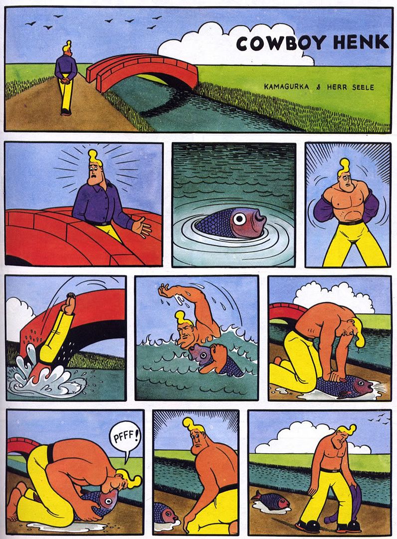

Cowboy Henk.


I am uncertain about the origins of this comic but it is popular on blog sites such as Tumblr and Blogger. The comics are single page sketches. They parody and mock certain parts of life. The colours and style are similar to that of the old beano and dandy comics. But the humour is very rude and risky. Adult comics.


Comic Diorama - Collected Comics - Grant Reynolds 2009. Top Shelf Productions.


Collections of short stories put together in an A5 format. Short stories based on journals recovered in a fire that took the life of the author. The journals are commonly known as ‘The Legends of Chance Oxblood'.

A very surreal collection of comics the stories are short and have limited text. A interesting view point exepcially as I have never considered basing a comic around real life events. The style of the comic flows nicely, it does change in drawing style from story to story but never does anything that doesn’t fit in with the rest of the comic. The minimal use of text in some stories is what Is fascinaticing as the illustrations can tell the story. Not a humorous comic in any sense as the tales can be slightly disturbing and the drawing style quite surreal.

The use of black pens to create texture and tone is what really stood out from the comic. Compared to larger scale production comics it is completely different. The characters are drawn in unconventional ways and is marketed to a adult audience as the stories are sometimes upsetting. Some stories are done with a single illustration on a single page.


Jack Teagle
Printed and distributed comics by 'NO GUTS NO GLORY'. 


Great sense of humour throughout his comics. The stories and illustrations are easy to follow, the sense of humour is light hearted but meant for a grown up audience. The drawing style is unlike other comics It is freely drawn and creative. The main emphasis is to create the characters and not the detailing on them. The characters are rarely put in life and death situations and even when they are they seem fun. 

Sherlock Holmes vs Skeletor 
Gareth J Brookes Self Published


The style of this particular comic is great. It does not rely on great image making to tell a good story. The story is fairly simple and set up as a sketch show. Each page being a different situation that the characters would get themselves into. The title of the comic and cover suggest that its going to be over the top big fight but actually the comic is very humane. there is no violence what so ever, It appeals to larger audience because of this.


DESIGN CONTEXT: B Movie Posters


B movie and old horror movie posters

I also took interest of old horror movie posters. I loved the way people were used as props in the picture just to constantly look scared.the proportions of all the images as well where the monster and human would be the main subject. The text which would seem cheesy and over the top. The whole image is over the top horror it doesn't scare because it seems humorous to ever think these creatures existed. The women being used as props inspired the idea of a monster holding a girl in his arms. I used this idea in a drawing and put them in the background. The lighting and colour was heavy as want the images to seem more dramatic and over the top.

A large part of my desire to do this was my fascination with old horror themed B- Movie posters. I found out that many B Movies only went into production after the film poster had been designed, and would often base the entire film from what was on the front of the poster. I thought it was fascinating that you could tell a story on just one image and then to make a movie of it. Also they had an element of humour, wether it was intentional or not. 
 

Monsters

As I mentioned previously I have been thinking about including a horror/monster element to my comic. I am unsure about the storyline so far and how this will fit into the comic as a whole but I would definatley like an element of horror to feature somewhere in my comic.

My plan is to keep drawing until I find something that really works then base my comic and the storyline around that. Because of this I have a lot of development work. Here is some of my monster development....